Vigesaa Productions
COVID 19 Home Page
Update July 17, 2023: Why does the North America have far higher vaccination rates yet also have far higher death rates compared to Africa?
The 1st chart shows vaccine doses per capita. The 2nd chart shows the total death per capita.
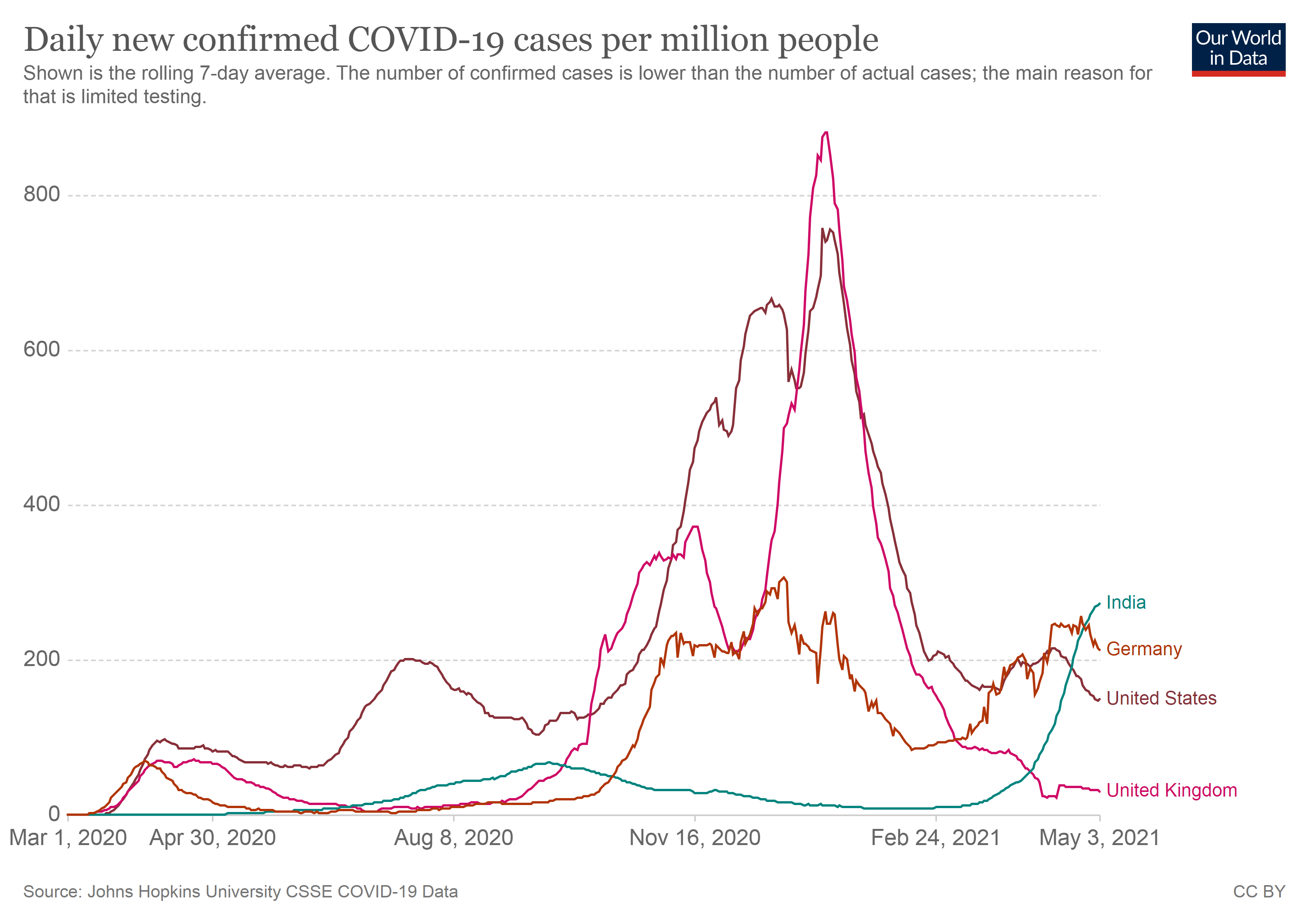
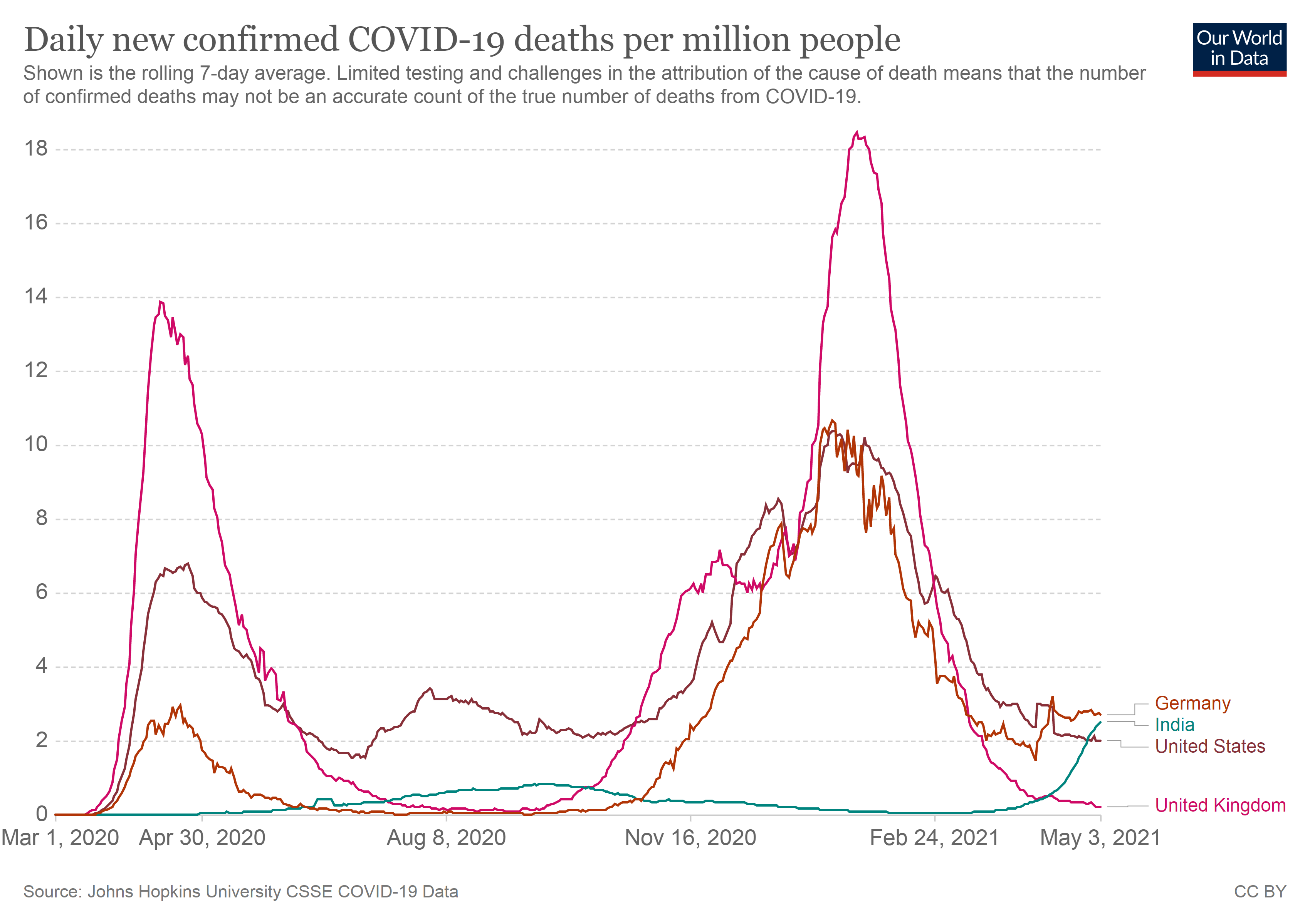
Update May 4, 2021: India vs other countries case and death rates. "Rates" are important if you are comparing countires. India has a population of around 1.3 Billion.
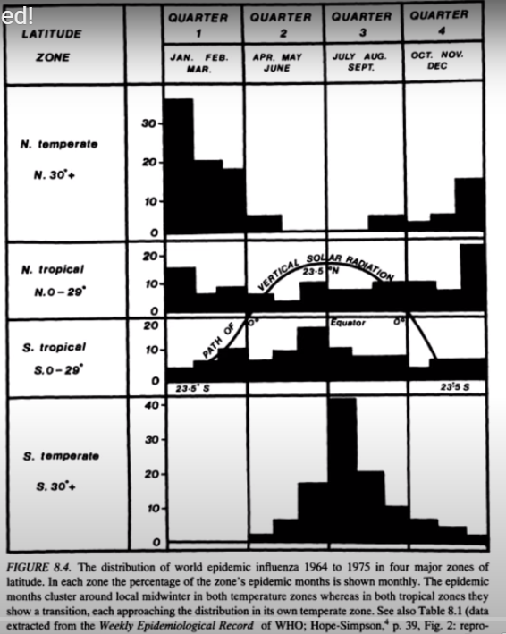
Download attached document showing how the virus follows seasonal and latitudinal distribution while ignoring all measures we take to stop it. Covid Seasonality Download
R. Edgar Hope Simpson figured out the seasonal-latitudinal distribution many years ago. (See black and white chart below). (Source data: https://covidtracking.com/)
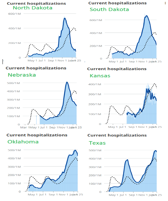
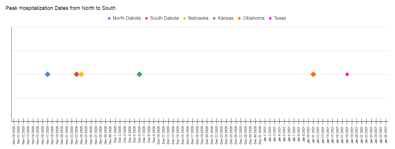
The simple chart below shows the peak dates for each state from North Dakota to Texas occur in sequence from North to South.
The hospitalization rates curves plotted for all states from North Dakota to Texas since around March. Try to find a state where lock downs or any other measures stopped this predictable curve. Determining if measures altered it slightly is more difficult, but considering the costs which also includes lives, shouldn't it be incredibly obvious?